Year: 2020

Belief at first sight Data visualization and the rationalization of seeing

Type: Paper
Year: 2020

The theme for this paper emerged from a 3-year project on visualizing open government data at the University of Calgary. During that time, we had many fruitful conversations over the implications of visualizing data for the public, and the implied trust in the data that this would or would not bring. This paper is a result of some of these conversations and you can download it here.

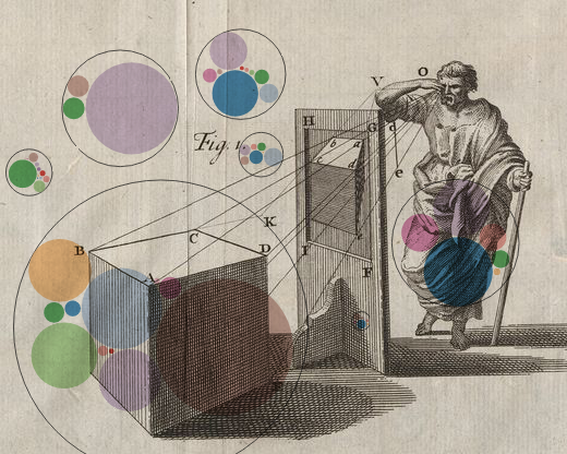
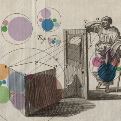
Abstract: Data visualizations are often represented in public discourse as objective proof of facts. However, a visualization is only a single translation of reality, just like any other media, representation devices, or modes of representation. If we wish to encourage thoughtful, informed, and literate consumption of data visualizations, it is crucial that we consider why they are often presented and interpreted as objective. We reflect theoretically on data visualization as a system of representation historically anchored in science, rationalism, and notions of objectivity. It establishes itself within a lineage of conventions for visual representations which extends from the Renaissance to the present and includes perspective drawing, photography, cinema and television, as well as computer graphics. By examining our tendency to see credibility in data visualizations and grounding that predisposition in a historical context, we hope to encourage more critical and nuanced production and interpretation of data visualizations in the public discourse.

Presentation at Information+ Conference:

Authors:

Doris Kosminsky, Jagoda Walny, Jo Vermeulen, Søren Knudsen, Wesley Willett, & Sheelagh Carpendale

Data Changes Everything: Challenges and Opportunities in Data Visualization Design Handoff

Type: Paper
Year: 2020

This article was published at IEEE Transactions on Visualization and Computer Graphics  and was granted Best Paper AWARD) at IEEE-VIS 2019

Download the complete article here. Or watch the presentation video below.

Abstract: Complex data visualization design projects often entail collaboration between people with different visualization-related skills. For example, many teams include both designers who create new visualization designs and developers who implement the resulting visualization software. We identify gaps between data characterization tools, visualization design tools, and development platforms that pose challenges for designer-developer teams working to create new data visualizations. While it is common for commercial interaction design tools to support collaboration between designers and developers, creating data visualizations poses several unique challenges that are not supported by current tools. In particular, visualization designers must characterize and build an understanding of the underlying data, then specify layouts, data encodings, and other data-driven parameters that will be robust across many different data values. In larger teams, designers must also clearly communicate these mappings and their dependencies to developers, clients, and other collaborators. We report observations and reflections from five large multidisciplinary visualization design projects and highlight six data-specific visualization challenges for design specification and handoff. These challenges include adapting to changing data, anticipating edge cases in data, understanding technical challenges, articulating data-dependent interactions, communicating data mappings, and preserving the integrity of data mappings across iterations. Based on these observations, we identify opportunities for future tools for prototyping, testing, and communicating data-driven designs, which might contribute to more successful and collaborative data visualization design.

Authors:

Jagoda Walny, Christian Frisson, Mieka West, Doris Kosminsky, Søren Knudsen, Sheelagh Carpendale, Wesley Willett

Palavras chave:

Ano da publicação