Reintroduction of tapirs in the Atlantic Forest of Rio de Janeiro
Dashboard of tapir’s conditions reintroduced in Rio de Janeiro
This project aims to build a visualization dashboard based on LEMAS data. The IFRJ Laboratório de Ecologia e Manejo de Animais Silvestres, which leds research on the reintroduction of tapirs in the Atlantic Forest.
“The Tapirus terrestris tapir is the largest native herbivorous mammal in South America, weighing up to 300kg. This species was extinct in Rio de Janeiro over a century ago. Its reintroduction may auxiliation in the restoration of ecological interactions and favor forest restoration.”
Research
The research for this project began in May when I visited the laboratory itself, on the São Cristóvão campus. This experience provided basic information on the projects related to tapirs reintroduction, as well as the summaries of each project. Each student carries out a different project around this theme, but some as a course completion project.
The highlighted data were body condition, seed dispersal, soil compaction, seedling condition (of reserve plants), vegetation structure and space use. Those selected were body condition and space use. For having a clearer use and referring directly to the same objects: the animals of the REGUA (Guapiaçú Ecological Reserve). The orienter, Maron Galliez, found the idea of the dashboard interesting and provided the spreadsheets with the data for the project execution.
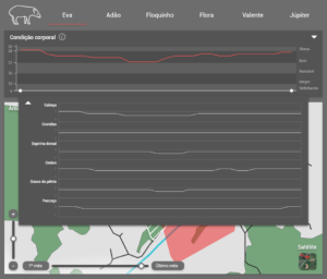
Body condition
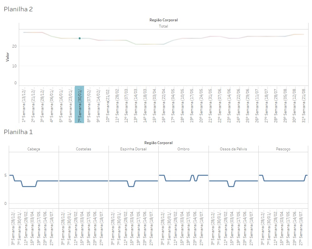
Body condition data refer to a calculation based on the circumference of specific body parts of each tapir. In Carolina Poublan’s project, each part of the animal’s body is marked with a score, then added, and related to a scale that goes from “languishing” to “obese”. Therefore the objective is to determine the health and food quality of tapirs in their adaptation period after release from captivity.
Use of space
Space usage data refer to the location obtained from GPS collars placed on each reserve animal, updated hourly. Julia Bontempo’s research serves to estimate the area needed for tapir life and to establish relationships of territoriality and population density, among other factors. The data of most interest here is the area each tapir occupies over the months after they release. The initial coding used points that marked the location of tapirs at the time of each GPS update. However, this coding was later changed to the smallest convex polygon method, for better expression of the estimated occupied area.
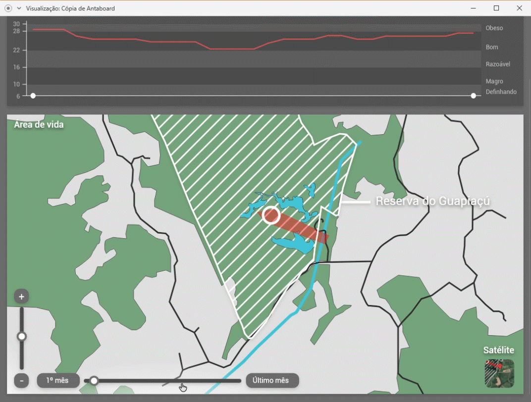
First version
Since the project object is a dashboard, coding did not have to be very elaborate or complex, with the goal of showing as much data as clearly as possible. With this in mind, body condition data has been encoded in line graphs, which can be easily overlaid without significant loss of readability. For these graphs, a way of explaining the calculation made to arrive at the results is also needed, as numerical data has no common units of measurement.
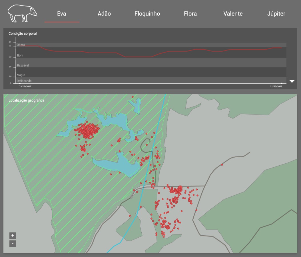
The main and the most space-consuming part of the information panel is the map showing the location of tapirs. For this map, there must be a way of understanding the time covered by it and the spatial boundaries of both the environmental reserve and the enclosed central part within it. Tapirs locations on the map were represented as points, but it was found that this is generally read as a population of animals rather than as an individual at separate times as intended. For this reason, the representation will be revised in the second version.
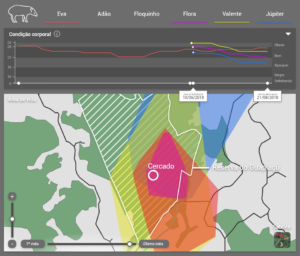
Second version
In the second version of the dashboard, the first modification was made to the map to solve the problem of the confusion whithin the number of tapirs. The view has been changed to show the smallest convex polygon that completely surrounds the recorded location points for each tapir. The living area is defined as this polygon. Areas may be overlapped for comparison purposes.
The map can be freely converted between “map” modes, which shows a simplified graphical representation. And “satellite,” which shows an aerial photo of the tapir reintroduction site, with the reserve area overlapping.
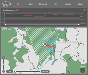
The map also features weather controls, showing tapir living area expansion, and zooming.
Graphical modifications of the second version
The other part of the dashboard, the body condition chart, also received modifications. Most of these modifications were made to improve the readability of the piece, like the alteration of colors and typography sizes. Subtitles showing the condition of each animal based on the score have been removed of the chart. The recording time have been modified to appear with mouse over only. But the most important modification of this part was the addition of data specific to each part of the tapir body, which add up to create the main graph. This data is accessible by an expander button, and when it appears, it is only for the first tapir selected from the list, left to right.
Conclusion
During the development of this project, I had contact with other students and research from an area that is considerably outside my specialty, but which I consider extremely relevant. One of the points of interest was in the research itself, such as the reintroduction of tapirs in the Atlantic forest. From this and other dense project experiences this semester, it became very clear how much contact between the areas is important, and how much, in such a project, direct communication between the parties is critical.
Visit labvis.eba.ufrj.br for more.