Data Sculpture: traffic of African slaves
The dispersal of enslaved Africans throughout the Atlantic world
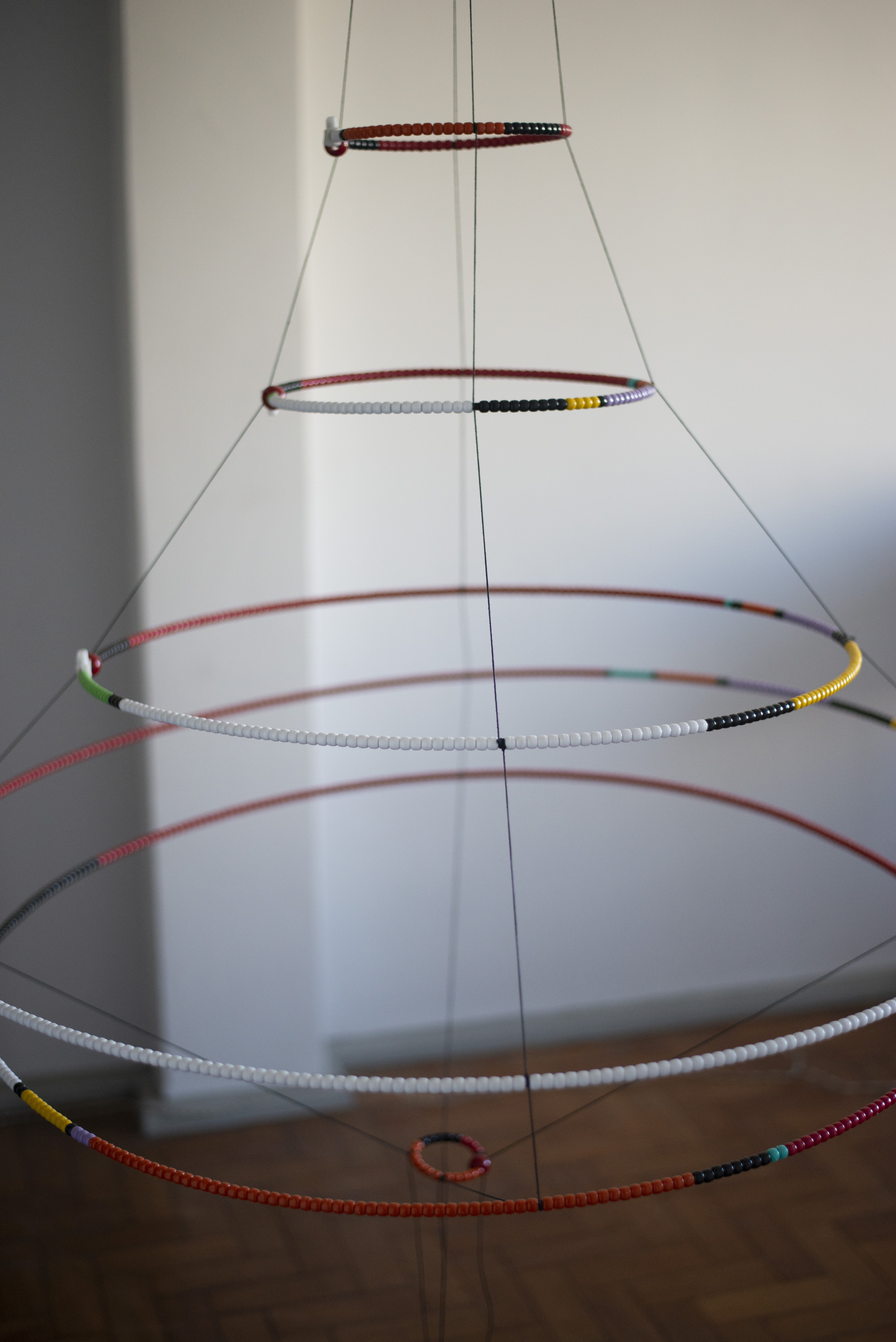
The presente work consistis in a physical data visualization. Fits into the field of art and design known as data art. The present data sculpture shows the traffic of african slaves, considering the number of men and women who crossed the Atlantic Ocean between the 15th and 19th centuries, many of them dying during the crossing. To accomplish this project, open data were employed, avaible at https://slavevoyages.org/, organized by Emory University, Usa, as a result of decades of independente and collaborative research. Altogether, the Transatlantic Slave Traffic Database has approximately 35,000 registered voyages. It is estimated that 12.5 million captives left Africa for America. It is the largest transoceanic migration of a people until now.

The project, research and creation
An inicial survey of the various african cultures and ethnicities indentified the use of beads in religious and festive ornaments, of africans and african-descendants, marking a significant cultural presence. In Brazil, for example, beads are used to make Guides and Bead-wires; which are the religious necklaces worn by the adherents of former african religions. In this context, they wold be responsible for establishing spiritual communication with the Orisha or the Entity, that is, they represent the link between material and the divine.
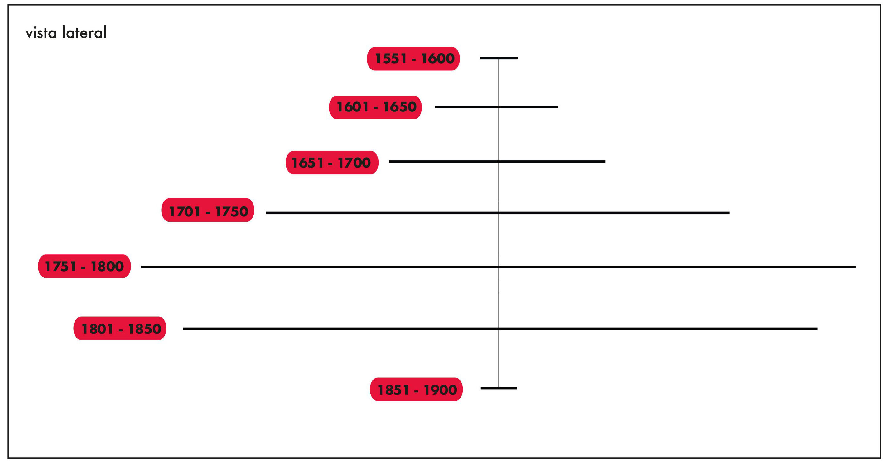
Given the large number of transported africans, the option taken was to apresent the distributed data in periods of 50 years, considering the so-called large slave trade embarkation and disembarkation regions. Even so, the major difficulty in this project was determining the numerical value represented by each bead, given that the values reach the order of millions. In the end, considering the physical display space of the piece, transportation issues and execution costs, it was established that each beads would represent 10,000 individuals. See schematics below for detailed mapping definitions.

Sculpture’s mounting scheme
In the picture above, each circular shape indicates one historical period. The periods were divided every 50 years. Notice how between 1751 and 1800 the heyday of slavery occurred. The last half century shows that the slavery was already forbidden in some countries.

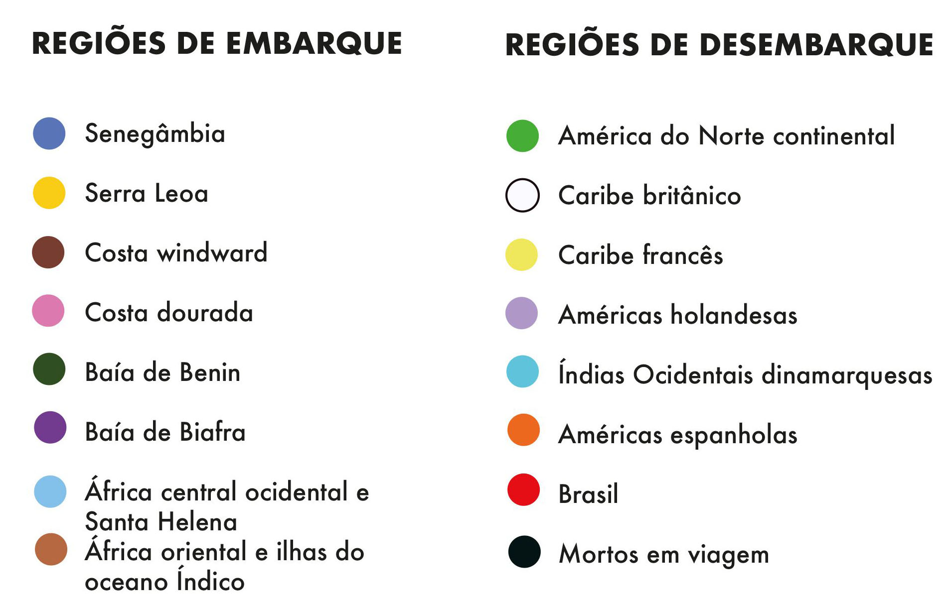
How to read the data
Each colored bead equals to 10,0000 africans who were displaced by slaves. A lower proportion would make impossible to perform the work. Smaller numbers have been supressed and others have been rounded. The colors indicate the big regions of embarkation and desembarkation.

Data Sculpture: Visual Communication course’s project
This work was done by Douglas Luddens in the project’s discipline Physical Data Visualization, Visual Communication Design course, School of Fine Arts, UFRJ, taught by professor Doris Kosminsky in the semester of 2019.1
Visit labvis.eba.ufrj.br for more.