ENEM through images: understanding Brazilian education
ENEM is the National Exam of Upper Secondary Education, organized by the Ministry of Education of Brazil to evaluate the knowledge obtained by students in Secondary Education. The ENEM consists of four multiple-choice tests with 45 questions each in addition to one essay, and is used as part of the selection process of hundreds of public and private higher education institutions.
In this project, we sought to produce interactive visualizations that could amplify the understanding of Brazilian education framework, focusing on ENEM results. Data was available from the Ministry of Education (MEC) for the year 2014, and emconpasses: the exam’s grades, age, gender, race, nationality and place of birth of the candidate and also the type of institution where they finish high school, the motivation to take the exam, existing disabilities and family income data, among others.
Choices from ENEM data
In this visualization, we used the average grades of the disciplines (Natural Sciences, Humanities, Languages, Mathematics and Essay) by state and also by candidates’ age. By the end, three different visualizations were created..
Visualization of the exams average grade by state
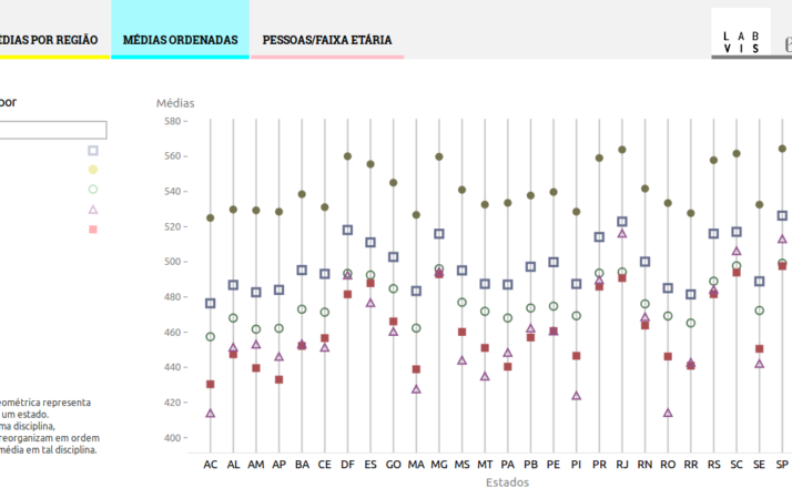
In this visualization, the disciplines’ averages are ordered by state. Each of the five disciplines is represented by a filled or blank geometric form listed in the interactive legend.
The average grade in each discipline is ordering from lowest to highest average. Upon choosing another discipline, the chart will be re-ordered according to the sequential average grade of the selected discipline, which will be highlighted. Upon hovering the icon of a discipline in the chart, the value will be presented in the legend.


Graphic decision over the small variation in averages
The small variation in the average grades could lead to poor visual information. For instance, the smallest grade in Essay was 412.11 points for the state of Acre and 514.15 for Rio de Janeiro – a difference of approximately 100 points, or about 1/4 of the lowest value. Beginning the scale in zero would push all the values very close to each other, making it difficult to compare the differences. Thus, we decided that the scale would range from 300 to 600. Changing the numerical scale in a visualization is a decision subject to criticism as it may lead to misunderstandings. But we stick with this decision for the average grades of ENEM as a way to avoid distortions in understanding the data.

How old are the applicants?
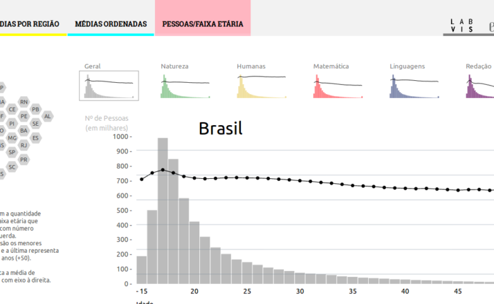
In this visualization, we lined up the disciplines average grade by state and by the amount of people from each age. The color of the bars varies with the discipline and their height varies with the number of people of that age who took the test. The line represents the average grade for each age. Using interaction, one can view details from other disciplines and locations.

Average by region: a thematic map
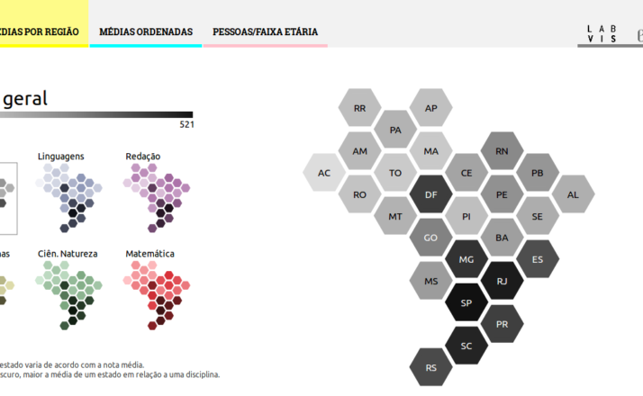
The third visualization aimed to present the average grades for state over a map. The production of the thematic map was theme of another article: a new map for Brazil.

Results and interactive product
The interactive product can be accessed here. The project went through numerous changes along with its execution but kept the basic ideas. It was an effort of a designer and a developer in a process that encompasses frequent discussions and shared decisions.
This work was part of a research project performed by undergraduate research assistants Moisés Colares (Visual Communication Design – School of Fine Arts, Federal University of Rio de Janeiro – UFRJ) and Heitor Tomaz (Electronic Engineering – UFRJ) in 2016, under the advice of Dr. Doris Kosminsky (School of Fine Arts – UFRJ) and Dr. Cláudio Esperança. (COPPE – UFRJ).