Year: 2020

Data Changes Everything: Challenges and Opportunities in Data Visualization Design Handoff

Type: Paper
Year: 2020

This article was published at IEEE Transactions on Visualization and Computer Graphics  and was granted Best Paper AWARD) at IEEE-VIS 2019

Download the complete article here. Or watch the presentation video below.

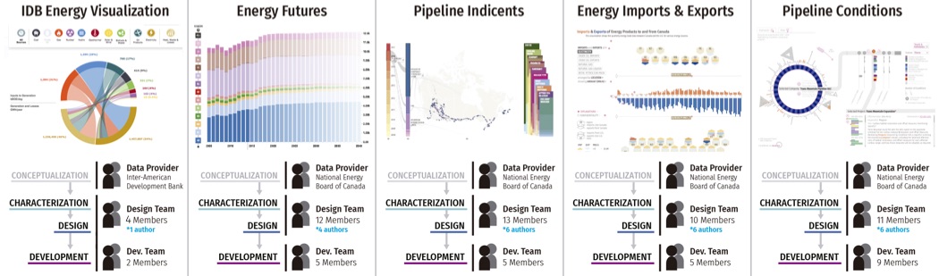
Abstract: Complex data visualization design projects often entail collaboration between people with different visualization-related skills. For example, many teams include both designers who create new visualization designs and developers who implement the resulting visualization software. We identify gaps between data characterization tools, visualization design tools, and development platforms that pose challenges for designer-developer teams working to create new data visualizations. While it is common for commercial interaction design tools to support collaboration between designers and developers, creating data visualizations poses several unique challenges that are not supported by current tools. In particular, visualization designers must characterize and build an understanding of the underlying data, then specify layouts, data encodings, and other data-driven parameters that will be robust across many different data values. In larger teams, designers must also clearly communicate these mappings and their dependencies to developers, clients, and other collaborators. We report observations and reflections from five large multidisciplinary visualization design projects and highlight six data-specific visualization challenges for design specification and handoff. These challenges include adapting to changing data, anticipating edge cases in data, understanding technical challenges, articulating data-dependent interactions, communicating data mappings, and preserving the integrity of data mappings across iterations. Based on these observations, we identify opportunities for future tools for prototyping, testing, and communicating data-driven designs, which might contribute to more successful and collaborative data visualization design.

Authors:

Jagoda Walny, Christian Frisson, Mieka West, Doris Kosminsky, Søren Knudsen, Sheelagh Carpendale, Wesley Willett

Palavras chave:

From data to material: experiences in data sculpture

Type: Paper
Year: 2019

Information visualization is the use of visual and interactive representations of data to amplify cognition. Although this production is usually focused on the creation of functionalist and pragmatic visualizations, there has been an advance in the field of artistic visualization as well as physical visualization. This article reports the unfolding of an experimental discipline of physical visualization, taught in the course of Visual Design Communication at the School of Fine Arts from the Federal University of Rio de Janeiro. The three best projects performed in the discipline are described, followed by an analysis that points out the need for specific actions related to data collection and understanding; descriptive elaboration of the project; choice and use of materials; tests and evaluations regarding the transmission of knowledge and aroused feelings. It concludes that elaborating these problems will be useful to the design of data sculptures.

Authors:

Doris Kosminsky, Douglas Thomaz de Oliveira, Luana Carolina da Silva, Eduarda Alves Isiris

Democratizing Open Energy Data for Public Discourse using Visualization

Type: Demo
Year: 2018

For this demo, we will show two interactive visualizations: Energy Futures and Pipeline Incidents. We designed and developed these visualizations as part of an open data initiative that aims to create interactive data visualizations to help make Canada’s energy data publicly accessible, transparent, and understandable. This work was conducted in collaboration with the National Energy Board of Canada (NEB) and a visualization software development company, VizworX.

Demonstration published in CHI EA ’18 Extended Abstracts of the 2018 CHI Conference on Human Factors in Computing Systems. ACM New York, NY Montreal, Canada (2018)

Authors:

Doris Kosminsky et al.

Palavras chave:

Discovering the Data Mapping of an Unfamiliar Visualization

Type: Poster
Year: 2018

This poster explores a data mapping exercise that we completed to extract a data mapping from an unfamiliar visualization and determine the process we followed in doing so. The exercise was completed using a visualization of imports and exports of energy products to and from Canada. We had no prior knowledge of the data set used. Our process included exploring the visualization, extracting the straightforward data mappings, collaboration, and visual structuring of the extracted mapping. Extracting the data mappings from complex visualizations can be a difficult process. By determining the steps through which a data mapping can be extracted and sharing these findings the community may help to determine the best approach to extracting data mappings from complex visualizations. This exercise contributes to our under-standing of how people extract meaning from the data mapping in a given visualization. This growing understanding can be used to influence design of data exploration and data extracting tools. The results may be applicable towards helping individuals read complex visualizations and obtain a fuller understanding of their data.

Poster published in the Proceedings of IEEE VIS: Visualization & Visual Analytics (2018)

Authors:

Doris Kosminsky et al.

Palavras chave:

Ano da publicação